As a mobile app developer with premium features, you are aware of the significance of a well-crafted paywall, which is the page where users buy premium features, and its effectiveness can determine your app’s revenue. This write-up provides insights on creating impactful paywalls that can enhance your subscription conversions.
Key UX Design Components to Boost Paywall Conversion Rates

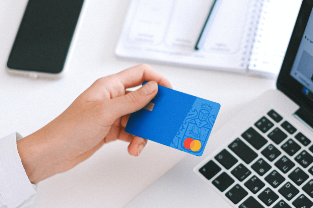
Source: ystl.ca
A paywall is a crucial aspect of a subscription-based business model that allows mobile app users to access premium content and features. To ensure that the paywall effectively converts users into paying subscribers, it must be well-designed with the appropriate user experience components.
To begin with, it is essential to provide comprehensive information about the premium features using a combination of textual and visual elements, such as screenshots or videos, to communicate the benefits of purchasing the premium subscription. Additionally, catchy headlines and flexible pricing options, such as monthly, yearly, or lifetime purchases, should be included to provide users with more flexibility.
It is also necessary to include an attention-grabbing button with an animation that draws users’ attention and displays social proof, such as the application’s good rating in the app store and user reviews, to convince potential subscribers. Finally, it is crucial to describe the premium subscription’s features and benefits clearly and concisely, such as ad-free browsing, access to exclusive content, and additional features unavailable to non-subscribers.
By incorporating these design elements, it is possible to create an informative, visually appealing, and user-friendly paywall that can increase paywall visibility and users’ likelihood of subscribing to your premium features, thereby generating more revenue for your business.
More Advice for Optimizing Your Paywall Effectiveness

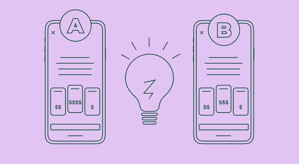
Source: thegood.com
Creating an effective paywall that converts users into paying subscribers involves more than just incorporating design elements. To optimize the paywall’s effectiveness, consider the following additional tips:
- One useful technique is adding screenshots of premium features that are not visible in the freemium version of the app. This can showcase the premium subscription’s additional benefits and incentivize users to upgrade.
- Another technique is using the “close button” trick, which involves delaying the appearance of the close button for a few seconds after the paywall is displayed. This increases the likelihood of users subscribing by forcing them to take a more extended look at the paywall.
- Offering a trial version for any premium subscription, such as a 30-day trial for monthly subscriptions and a 7-day trial for annual subscriptions, can provide users with a taste of what they can expect from the premium features. It is essential to clearly communicate to users how the trial works and that they will not be charged if they turn off their subscription.
- Including a special offer with a countdown timer can create a sense of urgency and encourage users to subscribe before the offer expires.
- It is also crucial to be transparent with your users. Including an FAQ section at the end of the paywall that answers common questions, such as “Can I turn off my subscription at any time?” or “How does the trial work?” shows that you care about your users and are willing to be open and honest with them.
Paywall Mistakes to Avoid

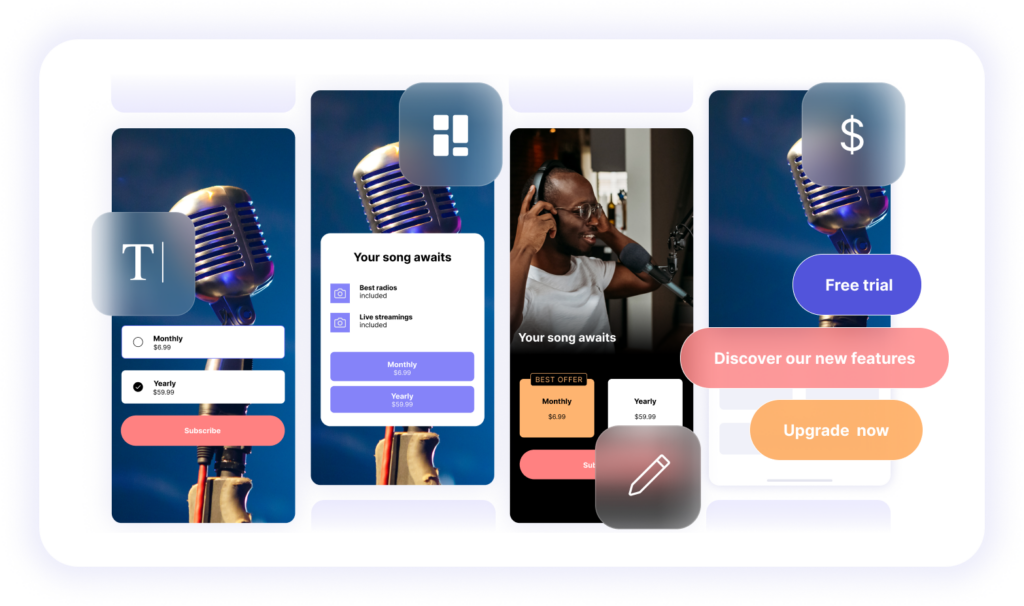
Source: adapty.io
Although there are various effective tactics for designing a paywall that converts, it’s essential to steer clear of some common errors.
One of the mistakes to avoid is utilizing generic terms like “subscription” or “purchase” in your paywall. Instead, opt for more engaging phrases like “Go Pro,” “Go Unlimited,” “Go Exclusive,” “Start trial,” or “Start Premium.” These phrases can generate a feeling of exclusivity and excitement surrounding your premium subscription.
Furthermore, it’s vital not to offer just one subscription option with a fixed price. Providing users with buying choices, such as monthly, yearly, or lifetime purchases, is essential. Additionally, you can convert the cost-effectiveness of an annual subscription into a monthly basis and recommend the most popular option.
Finally, it’s crucial not to display the paywall too early or too often. Ideally, the paywall should appear immediately after onboarding or when a user tries to access a premium feature. However, avoid being too pushy and presenting the paywall every time the user opens the app. This can be overwhelming and may discourage potential subscribers.
Optimal Timing for Displaying Your Paywall

Source: purchasely.com
Knowing the right time to display your paywall is just as important as designing it effectively. Poor timing can have a negative impact on both user experience and conversion rates. There are several best practices for when to show the paywall in your app.
One strategy is to display the paywall immediately after the user completes onboarding. This is when they are most engaged and interested in the app’s features, making it an opportune time to promote the premium subscription.
Another approach is to show the paywall when the user first opens the app. However, it’s important to be mindful not to overwhelm the user with the paywall. Depending on the app and user behavior, you can choose to show the paywall when the user opens the app or every few times.
You can also consider displaying the paywall when the user tries to access a premium feature that requires a subscription. This helps to showcase the value of the premium subscription and encourages users to upgrade.
Additionally, you can place an icon or widget on the home screen that reminds users of the premium subscription and takes them to the paywall page when clicked. This can help to keep the option of upgrading top of mind for users.
Enhancing Paywall Exposure and Conversion Rates
To generate revenue and keep customers engaged in a subscription-based business model, it is essential to optimize your paywall. By incorporating design elements that offer clear and concise information, available purchasing options, and social proof, you can build a paywall that emphasizes the value of your premium subscription and motivates users to upgrade. Additionally, to prevent common mistakes such as inflexible pricing, ambiguous language, and a lack of trial versions, it’s crucial to create a user-friendly paywall.
Finally, determining the appropriate time to present your paywall is crucial to balancing conversion and user experience. At Applover we know, that by following these best practices and regularly testing and refining your paywall, you can enhance your conversion rates and establish a thriving subscription-based business.


