In today’s business world, your logo is more than a mark on a page— it’s the face of your brand, the first thing customers see, and the emblem representing your entire mission. A strong logo can set the tone, build trust, and drive sales.
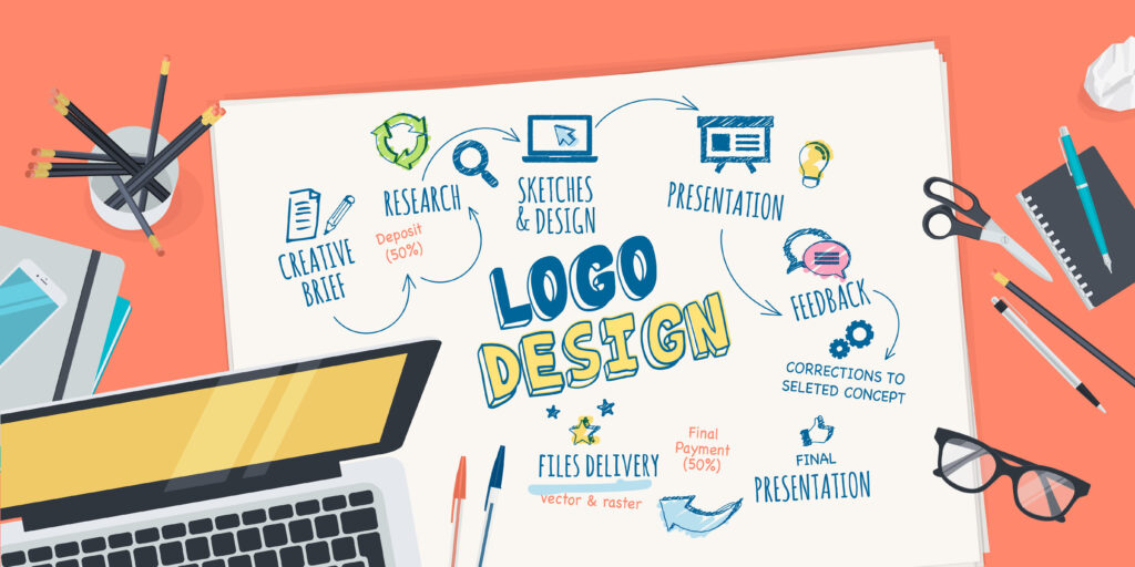
But with so many brands competing for attention, how do you make your logo unforgettable? Here’s a step-by-step guide to ensure your logo isn’t lost in the sea of sameness and drowns in competition.
1. Unraveling Your Brand’s Heartbeat

Before diving into design elements, knowing who you are is crucial. What does your brand represent? A logo isn’t just a pretty design; it represents your brand’s personality. Dive deep into your brand’s core values and consider what visual elements might capture them.
Suppose sustainability is one of your core values. In that case, you might use earthy tones, leaf motifs or even the planet Earth as visual elements. For companies that focus on community and unity, interlocking shapes, handshakes, or group symbols can evoke feelings of inclusivity. If your business values innovation, arrows, lightbulbs, or abstract shapes can emphasize your competitive edge.
Take a minute to list at least three things that you want your audience to feel when they seek your logo. Use these as a basis for planning and designing an eye-catching and meaningful visual for your brand.
2. Scout The Competition: Be Distinct And Ahead

Another pivotal step in design is understanding what’s already out there, especially within your niche. Indeed, you want to avoid a logo that can be easily confused with a competitor! Being aware of prevailing designs ensures your logo has its unique flavor.
You also want to find inspiration without imitating other brands. Check out the logos of your direct competitors to identify trends such as typical color schemes, shapes, or motifs within your industry.
Analyzing competitor also helps you evaluate their strengths and weaknesses. Knowing what logos stand out and why enables you to differentiate and define your own.
3. Tune IntoYour Audience

Source: linkedin.com
Your logo isn’t just for you—it’s a bridge between your brand and the people you aim to serve. Thus, knowing who they are and what resonates with them is paramount. A logo that strikes a chord will be effective in building loyal customers.
Imagine you’re opening a restaurant called ‘The Urban Eatery’ in the heart of the city. Your primary audience comprises young professionals aged 25 to 35 who want a quick, healthy bite in their busy schedules. They’ll likely value efficiency, health, and ambience.
To cater to this audience, your logo could feature a sleek, minimalist fork and knife intertwined with green leaves, representing fresh ingredients. A modern, clean font can emphasize a contemporary vibe. At the same time, a color palette of earthy greens and muted grays echoes the fusion of health and urban sophistication.
Understanding your audience ensures your logo isn’t just visually appealing but emotionally resonant for those you wish to attract.
4. Exploring Design Choices: Professional Or DIY

Source: linkedin.com
Now that you’re armed with your industry’s recent logo design trends and some knowledge about your intended market, it’s time to give your logo a unique touch.
Startups or small businesses with little to no design background can use a logo maker like Placeit to kickstart the design journey. However, if you have a budget and are looking for a truly distinctive design, collaborating with a professional designer can bring a fresh perspective to elevate your brand identity.
5. Keep It Simple
A simple and clean logo stands out in a world of information overload. It is easy for your audience to recall. Remember that the most iconic logos are usually the simplest.
When crafting your logo, you can choose between three types of logos: wordmark, pictorial, or combination. A wordmark logo uses your company name coupled with striking colors and fonts. This straightforward logo can help improve brand recall.
Pictorial logos showcase your creativity and purpose as they use an image to represent your business. In contrast, combination logos use brand names and images to tell your story at a glance.
6. Choose Design Elements Wisely

Source: behance.net
Once you’ve chosen your logotype, be wary of your colors. It’s essential to understand their psychological impact and how they’ll translate across different mediums. Stick to 2-3 primary colors that contrast nicely with each other. This will make your logo legible and striking.
Shapes, too, can convey deep emotions and meanings. Circles represent unity and wholeness, while squares and rectangles mean stability, trustworthiness, and order. Triangles symbolize power, stability, and direction, while irregular or uneven shapes represent natural and free-flowing ideas.
In addition, you should also consider the font style and size. The right combination of colors, fonts, and shapes can make your logo an effective brand visual—one that builds your brand and imprints it into the minds of your customers.
7. Make It Adaptable
Nowadays, a logo doesn’t merely sit on your storefront. It’s on your website, social media profiles, business cards, billboards, merchandise, etc. Ensuring adaptable means it looks and feels consistent no matter where your audience encounters it.
Imagine you’re branding a tech startup. You’ve designed a logo with intricate details, gradients, and shadows. It looks stunning on your website and poster. However, when you try to fit it into an app icon or embroider it on your company shirts, the details get lost, making it unrecognizable. To counter this, you could opt for a simpler, streamlined version for smaller apps, ensuring brand consistency across different mediums.
Your logo should grow with your brand. It may need minor tweaks such as colors or fonts, but they shouldn’t derail your brand image. Ensure that these changes will allow you to reach a larger audience and resonate with diverse groups.
8. Refine Your Logo Through Others’ Eyes
Imagine you’re designing a logo for a sustainable clothing brand. You’re thrilled with a leaf motif you’ve incorporated. But when you share it with different people, some find it cliché, while others feel it doesn’t communicate “apparel.” Such feedback could prompt you to rethink or refine certain elements, so your logo perfectly represents your brand.
Seeking feedback before finalizing your logo gives way to fresh perspectives and uncovers potential flaws. Use these insights to improve your design and ensure your logo isn’t just a personal masterpiece but a universally resonant symbol.
9. Safeguard Your Brand’s Signature
Your logo is more than a pretty design—it’s the visual embodiment of your brand’s identity, values, and promises. Just as you’d protect any asset, it’s crucial to safeguard your logo through trademarking.
A trademark gives you an exclusive right to use your logo in your industry, so no one else can legally copy or use a confusingly similar design. Should someone attempt to reproduce your logo without permission, a trademark provides legal grounds to take action against them. Lastly, a trademark ensures your customers and partners of your brand’s authenticity and longevity.
A trademark is a shield for your brand’s identity and reputation. By trademarking your logo, you proactively ensure your brand’s unique signature remains solely yours.
Crafting A Distinctive Logo In A Busy Marketplace
In the grand tapestry of branding, a distinctive logo isn’t just an aesthetic choice—it’s a strategic asset. So, invest the time to examine your core values, give considerable thought in your design elements and use all resources to make it exceptional, and watch it shine amidst the crowd.


